
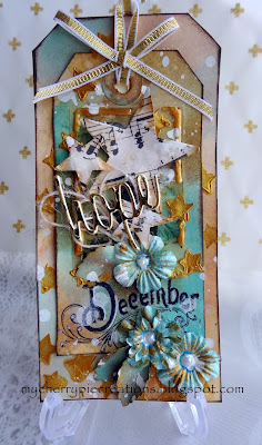
DECEMBER


NOVEMBER


 OCTOBER


AUGUST


JUNE
This month we hope to inspire you with this truly delightful painting by Luka Va called "Bird King".


MAY
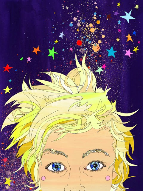
This month we feature Sarah Beetson with The return of the young prince.


 My eldest is growing so fast and last year she had an end of year disco that was a 70's theme. Her and her best friends really got into the theme and enjoyed their special night. They had stars in their eyes, so the stars in the sky at the top of the painting reflected their stars in their eyes.


APRIL


MARCH
This month we feature a delightful work by Barbara Hanrahan called The Dog, the Cat.
 CRITERIA is to use a quote or saying on your submission


I was inspired by the quote idea and used my favourite quote. Not having to pair it with a photo was a little different for me and I enjoyed using just the elements with the focus being the quote.
FEBRUARY
Muggles by Josh Miels and yes you guessed it, the challenge this month is a colour one.
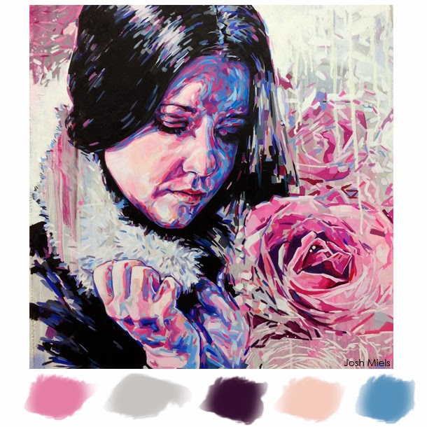

 For my LO I used the colours in the palette - but made them stronger, more in keeping with my masculine page. And you can see my photo is reflective, a lot like the girl in the inspiration piece!
 JANUARY
This month we hope to inspire you in a festive way with this beautiful painting by Alice Ju called Merry Christmas.

CRITERIA is the use of GOLD on your work
se of GOLD on your work
ANNA

I was inspired of the the Christmas baubles and there is a lot!! of gold :-)
TONE-LILL


Are you one of those who wake up on Christmas morning and suddenly realize that you forgot one present? Maybe it is for a close friend, an aunt, mother/mother in law.
Here is a suggestion how to make a quick, but still "made with love" present.
Most of us have candles and napkins in a cupboard, and they can easily be turned into a lovely gift
within minutes. I have used strips of Christmas paper and wrapped around the candles and then finished off with a decorated a tag and tied with a bow.
HELENE

I love to use gold on my layouts. On this one, I used gold colored acrylic paint and ink on the background. I also used patterned papers and embellishments with gold elements.
MARY

I have used Gold angel wings and gold flowers and satin seam binding. This was my fur babies last Christmas.
WENDY

The Christmas photos in my layout are four years old. I used these photos because they remind me of one of our more unusual Christmas parties. Unusual in the sense that it was in a wildlife park and part of the celebration was a bus tour to see the animals. Usually at Christmas the only wildlife we get to see are our family pets hanging around for their Christmas lunch! This time we saw lions, hippos, deer, giraffes, and much more. My husband helped Santa to distribute the presents and the look on the kid’s faces was priceless, ranging from terror to bewilderment to sheer delight. I enjoyed adding lots of gold on my page because it really added the final festive touch.
JANE
 I've used a gold star on the Christmas tree and gold bows as well as using a patterned paper that has a feel of gold about it.
JANE

LIZZY


That gold bow really took my eye. As did the colours and the circle shapes. So that's what I used!
ELAINE

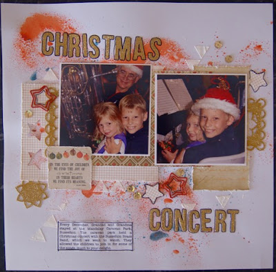
Every December, my Dad and Mum come and spend a number of weeks at a caravan park close to us. My parents live 4 hours from us so it has become a special time for the kids to spend with their Grandparents. The caravan park hosts the local brass band for a Christmas concert which we love going to. So that was the photos for my page. I love the gold and red baubles together in the inspiration painting and so I went for those colours myself. I just bought gold glitter paper so it was perfect for this month. I ran it through my cuttlebug for the title, frames and the star. I glued on little gold sequins to finish off the page.
JO

I've used Gold Texture Luxe with a Star stencil on the background, gold ribbon and dashes of Inka Gold the flowers & leaves. I also added the word Hope in shiny gold paper.
DEB

I have used the round baubles and bow as inspiration for my layout and used a photo of a Christmas decoration.
JANE
 I was inspired by the Christmas decoration theme and have highlighted one of the Christmas Angels we have on our tree each year made by my daughter when she was in Year 6. I have used splashes of gold and some gold embellishments.
JANE

NOVEMBER
This month we introduce Weeds by Emma Uber - you will find no prettier weeds anywhere !!

CRITERIA is the use of FLOWERS on your work
LIZZY

I adored the design and those bright, luscious pops of colour. Just had to use them on my layout!
ELAINE

I have gone with a photo of my parents this month. I picked the colours of the painting as my base colours which suited perfectly with this photo. For my flowers, I have used prima paper flowers and also some handmade flowers which I made using diecuts and punches.
JO

This is a double page for my Art Journal and I was inspired by the colourful flowers in the painting as it reminds me of Summer.
DEB

Taking inspiration from the title of the painting and the colours.
HELENE
 I made some white flowers using gesso and a stencil, and stamped black flowers on the background. I also used three different patterned papers with flowers, and some flower rub- ons.
WENDY


WENDY

I adore Emma Uber’s “Weeds”. Far from weeds, I see a beautiful portrait surrounded by gorgeous coloured flowers. The image is so fresh, and colours are so happy that I decided to scrap myself in a similar situation. I used this photo of myself because it was taken at my youngest son’s graduation, and I think my face shows how happy and proud I was. I blended my face into the background and surrounded myself with flowers and butterflies. Like Uber’s piece, I wanted to look like an integral part of the surroundings.
MARY

I was inspired by the lovely colours of red and Yellow and the flowers of course.
TONE-LILL


TONE-LILL


Inspired by the field of flowers - all different shapes and colours.
ANNA

I was inspired by the contrasting figure and the layered progression of colour.
STINA

I just loved the colors on this artwork, so I just had to use them on my project. Since the background was so vibrant with colors I chose to have only black on my embellishments.
JANE

I was inspired by the colours in this artwork and the random look of the background with splashes of paint here and there. I have used a vintage photograph of my mother as a baby - one of very few I have of her as a child.
This month we hope to inspire you with this beautiful painting by E Phillips Fox called The Green Parasol (1912)

CRITERIA this month is VINTAGE style
LIZZY


I was inspired by the garden and the soft, romantic colours. I utilised lots of vintage elements to pretty up this container for my scrapping flower supplies.
JO
I took my inspiration from the lady and the flowers in the painting and the soft tones.
ELAINE
 To create my background I have stuck lace and a doily to my page and then used gesso over the top
DEB
 This month I took inspiration from the colours, the flowers and the little black dog.
HELENE
 I chose to create a romantic layout using papers and embellishments with a vintage look.
JANE

ELAINE
of my whole page to blend them into my background. I then stencilled a doily stencil with modelling
paste and finally I used green and brown spray mist as inspired by the painting. I finished my page with my photo backed onto vintage papers which I distressed.
DEB

HELENE

JANE

I loved the soft feel of this artwork and it's setting within a garden with lots of beautiful blooms in evidence which I have tried to replicate on my page. This is a gorgeous vintage photograph of my Aunt when she was 3 years old and I totally love everything about it - from the bow in her hair to the little shoes on her feet.
WENDY

This vintage layout is of my maternal great grandmother who passed away 45 years before I was born. I used this photo because I love the outfit, the hair do, and the formal setting of the photos of that time. It always makes me think of times long gone, which is the same effect I have when I look at the inspirational artwork. I’m so happy that I can combine my love of scrapbooking with my love of family history as I have done here. The lady in the painting looks so relaxed and casual, unlike my lady, but the idea of my great grandmother being surrounded by flowers pleases me. “The Green Parasol” also inspired my colour scheme.
STINA
STINA

This was a really beautiful painting! In my card I was inspired by the soft colors and the beautiful flowers.
ANNA
 I was inspired of the green in the picture, the dress and flowers. I tried to go a bit romantic with the feel of my page. The photo is an old one of me when I did my graduation 1994!
MARY
 I was inspired by the colours in the painting.
TONE-LILL
 I was inspired by the beautiful flowers in this painting and I've added in some small vintage style embellishments and fabric to complete my page.
JANE
and another layout from me this month

I loved the soft green the artist used in this painting - it just makes the scene feel so peaceful. A perfect colour to use for this double page wedding spread.
ANNA

MARY

TONE-LILL

JANE
and another layout from me this month

I loved the soft green the artist used in this painting - it just makes the scene feel so peaceful. A perfect colour to use for this double page wedding spread.
SEPTEMBER
Our inspiration this month by William Knox called Arabian Scene.

CRITERIA is a free scrap (anything goes) but we need to know what inspired you (sails, sand, buildings, colours, shapes, location etc).
JO

I was inspired by the ocean, boats and colours.
LIZZY

I was totally inspired by the DESIGN used by William Knox, and used this to create a sketch for my page.
 I've included my 'sketch' as well, just so you can all see how I've used the art piece:)
DEB
 My inspiration firstly came from the colours and the sky, sea and sand which determined my background. I also took inspiration from the boat and the shape of the sails.
ELAINE
 The thing that struck me first when I saw this painting was the colours. They weren’t bright but rather
HELENE
 I was inspired by the colors, the sand and the sea.
WENDY
 I was inspired by the exotic location of the artwork. The Arabian theme of William Knox’s piece made me think of a visit to Morocco many years ago. It was such an interesting, unusual holiday and, every time I look at my photos, I can almost smell the spices at the souks (open air markets). The colours in the inspirational artwork are beautiful – the browns, beige and vivid blues. I used this as a guide for the colour palette of my layout.
LIZZY

I was totally inspired by the DESIGN used by William Knox, and used this to create a sketch for my page.

DEB

ELAINE

olden looking and I loved the feel it gave, a peaceful, loving feeling. So I picked up those colours
for my inspiration and came up with this page of my husband with our youngest. The love and peace
between these two is beautiful. I’ve used the quote to double up as my title.HELENE

WENDY

ANNA
 I was inspired of the old city and my thoughts went to our trip to Israel and Jerusalem. I also added the colors from the paint.

MARY
 The image made me think of our time on the beautiful island of Patmos.
STINA


This month I have altered a file folder, in which I'll put photos of a trip so that it becomes almost like a mini-album. I was inspired by the beautiful colors and the texture of the sand.
JANE
 I was inspired by the blue and sand and the seaside theme.
HELENE
has done another gorgeous page for us this month ...


STINA


This month I have altered a file folder, in which I'll put photos of a trip so that it becomes almost like a mini-album. I was inspired by the beautiful colors and the texture of the sand.
JANE

HELENE
has done another gorgeous page for us this month ...

inspired by the colors, sand and sea.
AUGUST
This month we hope to inspire you with this amazing painting by Kirra Jamison called Over The Moon.
LIZZY
My inspiration came from the background on this art piece. I love the black and white contrast! I've used black gesso because white pens work MUCH better on gesso than cardstock!
JO

I've used heaps of inks/sprays, stamps, paper, stencils, whipped spackle, Structure, and lace on the background. My owl is hand drawn by me.
ELAINE

I loved the stars all over the background and chose to use this as my inspiration for my page using flowers instead. I used ink to colour my modelling paste and after I had stencilled my flowers I left the mask on and splattered the ink on top as well. I used washi tape in the corner to create a background for my little flower cluster.
DEB
 The artwork inspired me to use an owl on my journal page in similar colours. On the background I’ve included doodling, stamping, paint, inks and paper.
HELENE
 I used three different masks to create some extra flowers and branches on the background. I dabbed with acrylic paint and highlighted them with a black pen.
MARY
 I decided to use the page from my Art Book that I was using for left over paint etc as my background. It's a crazy, messy background with leftover mist from a stencil, paint, texture paste ,tissue paper , and even scraps of pattern paper and painted backgrounds. The little pieces of torn up tissue paper were sent to me from my pen pal, so I added that to the Chaos as well.


DEB

HELENE

MARY

STINA

I have made a card for this month´s challenge and made the background myself. I started by misting the paper with different tones of pink and purple. After that I put some water drops on. Then I stamped with different kind of stampes and finally I used a mask and some modeling paste to make the flowers.
WENDY
 Just like the inspirational artwork I was "over the moon" to catch up with family from overseas and interstate over Easter. We had such a fun few days at our house. In keeping with the celebratory nature of the occasion, I kept my colour palette lighter than that used in the inspirational artwork. I did, however, use lots of stamping and stencilling to create texture on the background. I also included several photos on the page to show how much fun was had by both young and old(er).
TONE-LILL
 I just love this month's inspiration picture, it was the Black and White patterns that inspired me and the owl made me think of "free spirit" and this photo of my son. It was such great fun to work on a simple page just using strips of patterned papers and washi tape.
DI
 I was inspired by the dark background and twinkle of stars (as well as a favourite bird of mine). I've used a black and white photo of one of my little tawny frogmouths and placed this on a black background. The leaves have been stencilled with modelling paste (mother of pearl colour). I've added gemstones to represent stars and bursts of flowers simillar to those that are on the tree in These have been drawn with a silver sharpie.
LESLEY
 I really enjoyed layering this journal cover, I used stamps, template, inks and paints to blend the colours and give a depth of texture. I loved the dark colours used in our inspiration piece and hoe even with all the busy the owl stood out. What messy fun!
JANE
 I used various digital techniques to build up my background and then was inspired by the sweet owl to document a memory from my own childhood.
WENDY

TONE-LILL

DI

LESLEY

JANE

JULY
This month we hope to inspire you with this wonderful painting by Shirley Charlton (aka Shirlroma) called "Umbrellas, wet street".

LIZZY

I really loved this painting, so attempted to imitate the colours in the background, as well as the look of the paving. I used lots of wet mediums and have popped a step by step on my blog if anyone is interested in trying to create a similar look!
ELAINE

I just learnt a technique from my friend of using watercolour on scrapbook pages, so it was perfect timing. I painted first on clear acetate and then placed the acetate upside down on my page. The bonus was I could get the paint right before I placed it on my page. I did the top and bottom the same colours as the inspiration painting and placed my photo and embellishments along the centre of my page like the people are on the inspiration painting.
JO

I've used water and spray mists on this.
MARY

I started with choosing mist colours that made me think of a cold ,wet, winter day and spraying them in a manner to make it feel cold and gloomy. I added splats with ink and a stamp for puddles and rain splatting. I also added some leaf stamps for leaves on the ground. A crackle stamp for the pavement and I used the sequins for rain.
HELENE

I always use watercolors on my backgrounds and chose to do so on this layout too. This time I used green and yellow. To highlight the water color theme I also used patterned papers with water color patterns.
DEB

The starting point for my page was the combination of colours and I also took inspiration from the silhouettes and the wet pavement. I painted some watercolour paper first, using an ink tense block applied with a wet brush. Coloured texture paste through a stencil created the “path”. Then the “puddle” was formed by dropping mists from an eye dropper. Water was rubbed over non permanent ink for the border.
WENDY

To get the wet/liquid look I used Glimmer Mist, Kaiser Mists and sequins on the background. I was inspired by the vivid colours and the sense movement in the inspirational piece. I used birds, butterflies and flourishes to portray this sense of movement. I also used a large photo so the subject colour and detail wouldn't get lost.
TONE-LILL


It has been a rather miserable spring and early summer here in Norway this year, with lots if rain and low temperature, so this month's challenge picture was perfect for me ;)
I have made a box card with "a rainy day" stamp. I made my own pattern paper using stamps and stencils with Distress ink and stain, Dylusion spray ink, Glimmer Mist, acrylic paint and water with a spray mist. Every layer was dried well before adding the next one.
I have made a box card with "a rainy day" stamp. I made my own pattern paper using stamps and stencils with Distress ink and stain, Dylusion spray ink, Glimmer Mist, acrylic paint and water with a spray mist. Every layer was dried well before adding the next one.
Now it is your turn to have some fun with wet medias. Can't wait to see what you want to share with us :)
LESLEY

This month I was inspired by the dark & vibrant colours used, especially the purple. I have a word template that I have been looking forward to using so thought this would be the layout to do it. I have used Distress Stain, which added to the 'runny, wet' look of the layout. Due to all the words I kept the rest of the layout simple as I felt that the words say it all.
DI
 From the inspiration artwork this month, I used the colours of the background,(mine are more muted), the umbrellas, and the pops of colour from them and the people. I also loved the textural effect and started my background with a flagstone-like stencil. My 'wet' effects were produced using gesso sprayed with various ink mists, water and modelling pastes. I also used Glossy Accents on parts of the umbrellas and the title. As can be seen in the photo, taken in Hobart, rain is starting to fall on the nearby Mt Wellington, before sweeping into the city...... and no, we didn't have umbrellas, but made a dash for cover!
STINA
 I love this month´s painting so I was inspired both by the colors and the water element. Besides the gesso and modeling paste I have painted my background with mists and Twinklings H2O.
DI

STINA

JANE


Vivid Sydney is a unique annual event of light, music and ideas, featuring an outdoor 'gallery' of extraordinary lighting sculptures and spectacular illumination of many of Sydney's iconic buildings. This year much of the event experienced inclement weather and the image of bustling crowds and colour enhancing reflections on watery streets in the painting very much reminded me of similar scenes in the Sydney CBD.
JUNE
This month we hope to inspire you with this truly delightful painting by Luka Va called "Bird King".

CRITERIA is wood veneer and/or birds.
LIZZY

I was totally inspired by the blue tones and the wood for this page, as well as the design, with the clustering around the main image. I’ve taken these ideas and transferred them to my page. I was so happy to find some old magnetic wood [really plastic!] scrabble tiles to use for part of the title!
DEB

Lots of inspiration to be taken from this month’s challenge - mine came from the colours, the woodgrain background, the birds layered and tucked in (used this as inspiration for my photos/embellishments) and the patterns on the birds inspired the doodling on my page.
ELAINE

I love the colour aqua, so I had to go with that when I saw the inspiration piece, along with pops of orange from the main bird's beak. I have gone with a wood look background and then used wooden embellishments including a little wooden bird.
HELENE

I have both birds (on two different patterned papers) and a wood veneer (with a geo tag) on my layout.
JO

I've used both wood veneer and birds on this page.
JANE

I love quirky - why be the same when you can be that little bit different eh! And therefore I really like little sparrows, plain and common they may be but they are full of little quirks and chirps and will adjust to their circumstances and situations readily and happily just like these little fellows from across the ditch have done.
TONE-LILL


What do you think about our challenge picture this month? For me it is" how can you not be inspired by this?" such a fun and delightful piece of Art. It was of course the birds and the wood that inspired me, and this time to make a tag with space for a sentiment. I used birchbark and wood-veneer harts and paper with birds + a chipboard swallow
I hope you will join in with our challenge :)
WENDY

I wanted to create a fun, quirky layout to reflect my interpretation of “The Bird King”. I think the artwork is very cute and sweet and that’s what I wanted for my page. I used a sweet baby photo of my youngest son and created the layout with cute, quirky elements. I used a bird and wood veneer embellishments.
MARY

I chose to do my layout on this boy that we saw on our recent holiday on the Isle of Skye Scotland.He was not shy in strutting his stuff for us.
LESLEY

My background is a wooden theme paper and as soon as I saw it I wanted to scrap these lovely photos of strawberry collecting! I added some small wooden birds as there were lots of birds around collecting strawberries too!
DI

This month I have used some of the colours in the inspiration art piece to stamp a quirky edge for my page. To the background I've added cut and broken pieces of wood veneer samples to frame my two unusual photos. These were markings on a tree that caught my fancy and imagination. I know what I see, but I wonder what you see. I've also added wood veneer leaves, wooden birds and mushrooms.
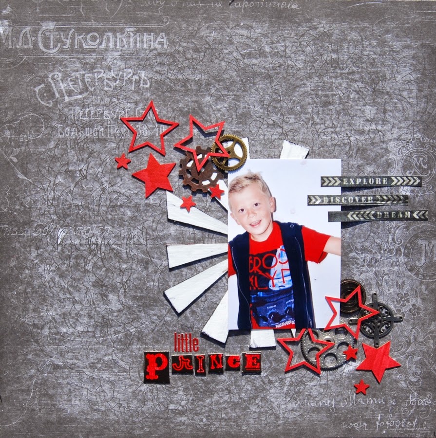
MAY
This month we feature Sarah Beetson with The return of the young prince.

Criteria is the use of STARS


A fun card combining the stars and colours of the inspiration artwork.

When I saw the inspiration , straight away I thought of my Grand daughter who has always loved to entertain . I found these photo's of her putting on a concert for us when she was little. She is our Little Star
I was inspired by the stars and the title, the return of the young prince, of the artwork. I also chose a dark background and red as an accent color.

DI
 This month I have constructed a large, iris-folded star as a mat background for the photo used. One of the papers in this was a stencilled experimental piece using Neon coloured inks and then oversprayed in sections with mists.The colours used on my layout corresponded with those from the inspirational artwork. Smaller stars were cut from the same papers as the the ones used for the iris folding, with the addition of some stickers. I edged the stars with dots from gold and black sharpies.

JANE
 I wanted to play up the star elements from the artwork by using a series of star embellishments and patterned paper and also including the star quality of my son's achievements at swimming when he was much younger.


I went with the colours from the inspiration painting, mainly yellow with pops of colour. Yellow from the prince's hair and the colours from the stars.
This piece of artwork inspired me to use, not only stars, but lots of colour. I've gone to town with the Gelatos and Mists. I also used the "emboss resist" technique on this page.

Stars and my grandboy go together, so for a change I thought I’d do a Project Life page for this challenge. I really loved the idea of using the colours from the art piece & incorporating as many stars as I could! The white ‘splotches’ on the background? Nail polish!!!

The inspiration for my “border" came from the background in the artwork.

I was inspired by the colours and youthfulness of Sara Beetson’s artwork. I thought it was a perfect piece to inspire me to scrap a photo of my son from his recent trip to Japan. This was the first independent overseas trip for my son. I chose this photo, taken at the Tokyo Tower, because it screams “youth, fun and colour” …. Just like Sara Beetson’s artwork.

APRIL
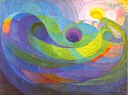
This month we feature this delightful work by Roy de Maistre called Frozen Music.

CRITERIA is to use swirls on your submission.
LIZZY

I took the swirls and created a mixed media background with some of the colours in the art piece to show that you can use the same paper to create 4 very different cards. Gelatos and lots of stamps came out to play this month!
JO

This artwork inspired me to use water colours as well as some of my flourishes that I've had in my stash for ages. I used the emboss-resist technique on this paper which already had some lovely swirls printed on it.
DEB
 I’ve used some of the colours in the artwork as inspiration to alter my photo. For the added criteria of “swirls” I’ve added masking and rub ons to the page.
ELAINE
 I love the different look of this painting and chose a background paper with the same looking effect and colours. My swirls are in the embellishments and the twine at the end of the banner.
HELENE
 Sometimes our daughter make a kind of drawing that looks a bit like the inspirational piece. I asked her to draw one in the same colors as the inspiration picture and used it as a patterned papers. So there you will find my swirls.
JANE


DEB

ELAINE

HELENE

JANE

I used the colours from the inspiration painting to help create my layout. I really liked the almost cosmic feel this painting evokes and went with the same feeling for my own page.
STINA

For this challenge I chose to do a card inspired by the purple and the green in the painting. It made me think of spring. I also had to use my new swirl die for the card, I´m so in love with it.
TONE-LILL


A fantastic and colourful artwork as inspiration this month, I just love the colours..... so as you can see both the swirls and colours inspired me making this page. I have used some of the flowers I showed you how to make earlier this month. I hope you find some inspiration too and want to join us here at ARTastic at our April challenge :)
WENDY
 I used layers of swirls for the background. My aim was to create the illusion of the universe and reinforce the idea that, as young graduates, my sons have the world at their feet.
MARY
 I was inspired by the colours and the swirls. The photo of the grass in front of the colourful houses in Ireland remind me of the swirls, like the weather, if that makes sense :)
DI
 This month I have taken advantage of our added requirement of swirls to complete my layout with doodled flourishes and swirls using a silver Sharpie. The photos are of the Natural Bridge at Numinbah,on the rim of the Mt Warning crater, about 30 minutes from the small township of Murwillumbah on the far North Coast of NSW. My layout is reflecting the photos showing a flow of water from a creek and its progression, tumbling down a steep rocky outcrop into a cavern where it cascades into a pool before once again splashing out into a small creek.
LESLEY
 I loved the soft texture of the swirls in this piece of art and wanted to reflect this is my layout. When I found these watercolour flowers I knew I needed to use them. I added more swirls with chalkboard arrows and gem.
TONE-LILL


A fantastic and colourful artwork as inspiration this month, I just love the colours..... so as you can see both the swirls and colours inspired me making this page. I have used some of the flowers I showed you how to make earlier this month. I hope you find some inspiration too and want to join us here at ARTastic at our April challenge :)
WENDY

MARY

DI

The background is on a pearlised cardstock and water drops have been cut from glitter cardstock. I've added strands of glitter yarn, fabric and paper orchids in the colours taken from our inspirational painting, acetate butterflies and dragonflies and painted chipboard mushrooms. The edges have a drawn border of water droplets, again using a silver Sharpie.
LESLEY

This month we feature a delightful work by Barbara Hanrahan called The Dog, the Cat.


I've used a quote from Lucy Maud Montgomery (a Canadian Author), which is perfect for my photo.


I’ve used the quote ‘We are marked by our experiences in life’, and made lots of marks on my page….mimicking the marks on the animals in the inspiration picture! This makes it a sort of visual pun on the quote! I’ve also used those lovely, bright, fun colours – I think they look fabulous against the black, so I couldn’t go past that!

There is so much to take inspiration from in this artwork. My first thought was to try a photo transfer of my kitty kat. Then taking inspiration from the colours, the stripes and spots, I created my page around it.

My background was inspired by the bold colours and also the stripes from the cat. I also love the fun feeling the inspiration painting creates and used that for the theme for my page. My quote is centred around the fact that this little girl is a Daddy’s girl through and through.
HELENE
 I used a quote by Einstein. I thought it was perfect with this photo of two dirty girls who definitely have been playing. I splashed paint on the background to accentuate my mud theme.

WENDY


Barbara Hanrahan’s artwork is so quirky that it immediately inspired me to scrap my pets. In keeping with the fun, quirky approach, I decided to create a bright coloured comic book style page. I did my journaling in speech/dream bubbles so it looks like the animals are talking or dreaming about themselves. And, while I love all my fur babies, the quote does really reflect the difference between cats and dogs.
JANE


 "At sunset nature is painting for us... day after day... infinite beauty." John Ruskin, is the quote I have chosen to use for this challenge. The sunset photos I've chosen have some of the colours from our inspirational artwork as well as unusual stripes and striations. This feature, also picked up from our image, has been extended onto the black background with the addition of stencilling and swipes of colour using texture pastes, sprays and dimensional pearls. Additionally, I have used sprayed and torn tissue paper, again using the colours shown on the artwork.

JANE

I was inspired by the colours in the artwork and the amusing character of the animals and used a cute photo of my son from younger years. I've used a quote by Eleanor Roosevelt "Happiness isn't a goal, it's a by product", which I thought appropriate for photographs of little children being silly.
STINA
 This month I chose to do two tags with some quotes on. Perfect to have in stock whenever you need it. I decorated with some chipboards and flowers.
MARY
 I took my inspiration from the colours and patterns. I created my background with paints and also used a stencil here and there for the pattern.

MARY

The quote I used "You make me Happy when skies are grey " seemed appropriate for this photo. It was my birthday and it was also the day my Mum had to go into a nursing home. It was a very hard and sad period of my life. When I was looking for a photo for the challenge and came across the photo's of my birthday I hated them all of me. They say the eyes are the windows to our soul and in every photo my eyes look tired, hollow and sad. But then I saw this one of me looking at my Grandson and smiling. My Grand children are my comfort and sunshine when skies are grey.
TONE-LILL
TONE-LILL

I love this super cool inspiration picture in March and it was the colours and patterns that inspired me. I used a photo of the kids, taken at Lizard Point (as far south as you can get in England( GB) in Spring holiday and it was pouring down with rain that day and that's why I chose this saying.
DI
DI
I was inspired by the quote idea and used my favourite quote. Not having to pair it with a photo was a little different for me and I enjoyed using just the elements with the focus being the quote.

FEBRUARY
Muggles by Josh Miels and yes you guessed it, the challenge this month is a colour one.


The colours reminded me of a recent sunset on our beach holiday. I think this is the first time I've ever incorporated pink into a masculine page, but I think I got away with it.
HELENE

DEB
 Along with following the colour palette, I was inspired by the beauty and softness I saw in the artwork. Using a wash for the background colours, I tried to create this softness.
MARY

ELAINE


JANE
 A mixed media background without the media - got to love digital scrapbooking for those of us who don't deal well with the mess :)

HELENE
The perfect pastel palette ...
DEB

MARY

I was influenced by the big flowers and the swirls in the ladies face. I have used texture paste to create swirls and added glitz and glitter. I also felt the painting is quite dramatic, which I tried to reflect in the layout. I was influenced by the colours which I felt were dramatic as well.
ELAINE
A tribute page using the colours palette beautifully ...


It is such a gorgeous inspiration picture this month and I fell in love with the colour palette. Even on the photo (of my DD and her friend at their year 7 prom) I altered the colours to fit in with the inspiration picture.
We would love to see an altered or up cycled project from you for our challenge, and you have got 2 more weeks to play along :)

Last year my In-Laws renewed their wedding vows to celebrate their 50th anniversary. The colour theme was lavender, blue and pink so the colour scheme for this challenge matched in perfectly. And I loved the flowers, I always love flowers! This photo of me and my eldest daughter is one I have been looking forward to scrapping and thought a subtle version of the colours would highlight the fun, loving, family day that we had together.

Not my normal colour palette, but I love the soft feminine hues. I used flowers in my layout to create a look similar to the feminine look in the painting. Also, the face in the painting is very strong so I chose a close-up head shot for my layout. There’s a lot going on in the painting with the colour blending and pronounced brush strokes and I have tried to create this sort of depth on my page with layering. I created the back ground with water colour paint, Gelatos and Gesso. I used stencilling, die cuts, chipboard and flowers to build the layers.
JANE


The colour palette was so inspirational this month. I loved the tones used as well as the portrait. From the inspiration artwork I have used the colours, a portrait and the flower theme to make the first page of a mini album. This has been made from canvas, painted with acrylic paint and stamped. I've also added chain stitch, button flowers, as well as chipboard butterflies, painted with Liquid Pearls to the mix.
STINA

 I just loved the colours on this challenge! I used a lot of different mists, gesso and stamps to create the background around the photo, then I decorated with flowers, chipboard and metal embellishments.


We start off with this really delightful street art by Fintan Magee. Aren't these little guys adorable!

This is a free scrap with no set criteria so make of it as you will but don't forget to tell us what inspired you about the painting - the brickwork, the super hero costumes, the little boys, the colours ... whatever you like.

My inspiration came from the brick wall & the colours. Also the touch of graffiti.


I’ve taken the idea of the brick background, & found this photo which I thought had a similar look to the superheroes in the inspiration piece. Loved the natural tones with the pop of colour, so I used that idea as well.

The little super hero's sitting in a line in front of a brick wall inspired me to use these 4 photos in a line using a brick mask as the background.
ELAINE
 I have gone with the hero theme and created a page of my son, who is my hero. He has Autism and each day is a challenge for him. I have used the colours of the boys in the painting, but swapped the red for orange. I crocheted some embellishments for this page. I enjoy using other crafts on my pages; that the kids can look at their pages and see a bit of me in them :-).
HELENE
 I was inspired by the masquerade theme and the brick wall.
JANE

The four little boys lined up in costume reminded so much of these three boys lined up in costume that I just had to do a page depicting a rare school dress-up moment.

ELAINE

HELENE

JANE

The four little boys lined up in costume reminded so much of these three boys lined up in costume that I just had to do a page depicting a rare school dress-up moment.
WENDY

I have lots of photos of street art but I decided to use two photos of street art in Melbourne city. I also love the idea of using a brick wall as the background.
MARY
 The scene of these cute little super hero's reminded me of street art and that is where I have taken my inspiration from. I remembered I had taken a photo of a mural at Bondi Beach and thought it would be perfect for this challenge. That is what I love about challenges, I probably would never have scrapped this otherwise, and now I am happy that I did.

DI
 For my layout this month, I've mainly used the brick wall for my inspiration. To get a grungier effect, I've used a background with various inks and sprays and stenciled with gesso. Once this was dry I used a wall stencil over the top and also added some cardboard which was embossed and inked. Washi tape and stamps have also been used. The photo is of a beautiful mosaic mural on a wall of a building in Dorrigo.

STINA


 I did two tags for this month. I was inspired by the colours and the brick wall. I have decorated with a lot of chipboard, including a brick wall and a lantern. The big flower I made myself and you can find a tutorial in this month's 3T's.


No comments:
Post a Comment